Token authentication, phone number verification or any form of Two-Factor Authentication are common features nowadays.
A pattern that emerges from the fact that these codes tend to conform to a set number of characters is the input verification box.
In this article, we will learn how to build an OTP input with Stimulus that's configurable and offers a nice user experience.
Let's start by understanding how we can approach this component:
About the approach
If we peek under the hood, most of the OTP input components around the web are built using a single hidden field in combination with several text inputs with some JavaScript on top to make it behave like we previously stated.
However, there are some accessibility concerns with this approach, like Justin Searls explains in his take on an OTP input, having many inputs, one for every digit, representing a single value (the code) can be confusing for users using screen readers.
But there are some parts of the patterns that users are familiar with, like the focus of the current slot, keyboard navigation which also facilitates the edition of the value.
So, for this article, we will build the component using two approaches:
- Using a single input and adding some styling to make the component behave as much of the expected behavior as possible while being accessible by default without much work.
- Using multiple inputs and JavaScript to edit the actual value in the hidden field. However, we will make the component as accessible as possible with ARIA attributes, roles, and labels.
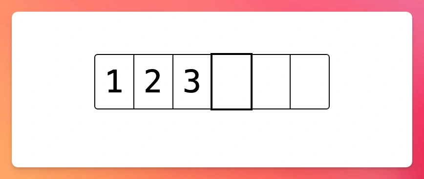
What we will build
For the reasons explained above, we will build two versions of the same component: a slotted One-Time Password input using StimulusJS.
To improve user experience, we will render a number of slots or boxes that match the number of digits of said code.
This pattern helps us enforce that the number of digits introduced in the input has to exactly match the expected amount without causing any annoyance to the user.
The accessible-by-default version will support:
- Rendering a single input that acts as a container for the slots, which are divided with CSS. The separation between the letters will also be added using CSS
- Add the ability to paste the code without any issues.
The feature with multiple inputs and a hidden code input will support:
- User keyboard input while focusing the "current" slot to ease the user into the flow.
- Ability to paste the whole code at once.
- Ability to navigate between the slots/digits to make sure users can easily edit the values.
- Ability to erase the current slot by pressing the
Backspacecharacter and navigating to the previous input in that case. - Enabling the form to submit only if the slots are not empty or incomplete.
The result looks like this:
Now that we have an idea of what the result should be, let's set our application up. Skip to the actual component if you already have an application, or if you're rushing.
Application setup
We won't be touching anything backend related for this tutorial, but we will still use Rails to render the form because it's probable that you will be using it when building a feature like this with Stimulus.
Let's start by creating the application:
rails new otp --css=tailwind --javascript=esbuild
Then, let's add the routes for the otp resource:
# config/routes.rb
resource :otp, only: [:new, :create]
The corresponding controller:
# app/controllers/otp_controller.rb
class OtpController < ApplicationController
  def new
  end

  def create
  end
end
Finally, let's add an empty controller in otp_controller.js:
// app/javascript/controllers/otp_controller.js
import { Controller } from "@hotwired/stimulus"

export default class extends Controller {
  connect() {
    console.log("Hello from the input verification controller")
  }
}
Now we should be ready to build our feature
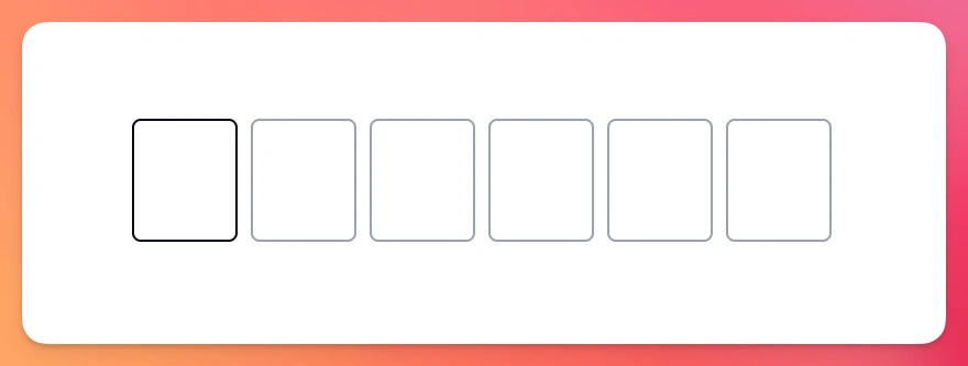
Using a single input
The simplest way to make an OTP input using Stimulus is to define an input element that works as any text input and then add slots using CSS.
This approach is also accessible by default because it uses a text input just like any other form. There's no need to add any ARIA labels.
The final result will look something like this:
Let's start by adding the markup:
<%# app/views/otp/new.html.erb %>
<div class="group flex items-center relative pointer-events-none h-24 font-mono"
  data-controller="otp"
  data-otp-pattern-value="[0-9]"
  data-otp-current-index-value="0"
  data-otp-filled-class="border-slate-950">
  <div class="flex">
    <% 6.times do %>
      <div class="relative w-10 md:w-20 h-14 md:h-28 text-[2rem] md:text-[4rem] flex items-center justify-center border-r-2 border-l-2 border-t-2 mr-1 border-b-2 last:border-r-2 border-gray-400 rounded-lg transition-all duration-300 hover:border-gray-400" data-otp-target="box"></div>
    <% end %>
  </div>

  <div class="absolute inset-0 pointer-events-none">
    <input type="text" class="absolute inset-0 focus:ring-0 focus:outline-none border-none font-mono text-[26px] sm:text-[32px] tracking-[26px] sm:tracking-[32px] z-10 pointer-events-auto text-transparent" data-otp-target="input" data-action="input->otp#input" autocomplete="one-time-code">
  </div>
</div>
What we're doing here is rendering a container div with two children: a div that contains 6 equally sized boxes and another div that contains an absolutely positioned input with the text color set to transparent.
That input can be accessed by screen readers normally, while we can also show and animate the familiar boxes for this type of component.
We define two types of targets: box and input, which represent the individual boxes that will contain the digits and the input field, respectively.
We also define a pattern value, which is a regular expression that we use to match against the values inputted by the user.
Finally, we're also adding a single filled class that we have to add or remove depending on whether the input is focused or not.
Let's start by focusing the input when the controller connects:
// app/javascript/controllers/otp_controller.js
import { Controller } from "@hotwired/stimulus"

export default class extends Controller {
  static targets = ["box", "input"]
  static values = { pattern: String }
  static classes = ["filled"]

  connect() {
    this.inputTarget.focus()
    this.boxTargets[0].classList.add(this.filledClass)
  }
}
We're declaring the targets, values and classes, and in the connect method we're focusing the input and adding a highlight border color using the filledClass.
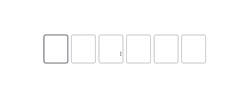
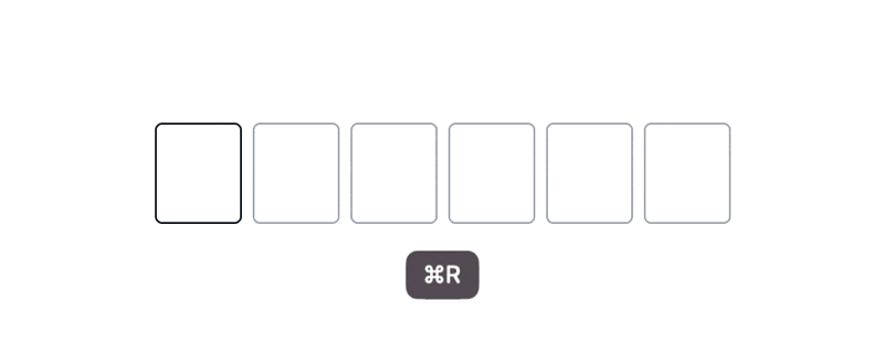
After loading, we should get the following:
However, because we set the text on the input to be transparent, if we type into the field we won't get any feedback, even if the input is being populated.
Let's fix this by adding the input action which takes the value from the input, validates it against our pattern and populates the textContent for each one of the boxes that should get a character:
// app/javascript/controllers/otp_controller.js
export default class extends Controller {
  // Rest of the code

  input() {
    const raw = this.inputTarget.value
    const filtered = (raw.match(this.regex) || [])
      .slice(0, this.boxTargets.length)
      .join("")
    if (raw !== filtered) this.inputTarget.value = filtered

    this.#updateBoxes()
  }

  get regex() {
    return new RegExp(this.patternValue, "g")
  }
}
What the input action is doing is: taking the raw value from input and storing it in a variable. Next, it matches it against the regex getter, which returns an instance of RegExp with the pattern we passed.
This returns an array of values that matches our regular expression, or null in case no character matches the expression:
const regex = new RegExp("[0-9]", "g")
"12a3/b59".match(regex) // Returns ["1", "2", "3", "5", "9"]
"abcdefg".match(regex) // Returns null
So, the filtered variable will be populated by an array of the characters that can't exceed the maximum allowed length, which is defined by the number of boxes we added in the otp view.
Then, in case the raw and filtered values are different, meaning we changed what the user already typed into the input, we change the input's value to match the filtered content.
Finally, we call a yet undefined updateBoxes method, which is responsible for adding the text to each box and visually highlighting them when appropriate:
export default class extends Controller {
  // Rest of the code

  #updateBoxes() {
    const value = this.inputTarget.value
    const currentIndex = Math.min(value.length, this.boxTargets.length)

    this.boxTargets.slice(0, currentIndex).forEach((box, i) => {
      box.textContent = value[i]
      box.classList.add(this.filledClass)
    })

    this.boxTargets.slice(currentIndex).forEach((box, i) => {
      box.textContent = ""
      box.classList.remove(this.filledClass)
    })
  }
}
What this method does is take the value from the input and a currentIndex which is the length of the input text with a cap at the length of the boxes.
Then, it loops from the start of the array of boxes to the currentIndex, which is the point where the "cursor" is at, sets the textContent for each one of the boxes to the value of the text at the i index and adds the filledClass to every box until the currentIndex.
The second loop takes the rest of the boxes, sets the content to an empty string and removes the filled class so we only highlight the boxes that already have content in them or that are active:
Ability to paste
Now that we have the feature working like we want, let's add the ability to paste the code.
The first step is to add the paste action to the input:
<%# app/views/otp/new.html.erb %>
<input type="text" data-otp-target="input" data-action="input->otp#input paste->otp#paste">
Then, we have to add the paste action to the controller where we handle the behavior:
// app/javascript/controllers/otp_controller.js
export default class extends Controller {
  // Rest of the code

  async paste(evt) {
    evt.preventDefault()

    try {
      const raw = (await navigator.clipboard.readText()).trim()
      const filtered = this.#filter(raw)

      this.inputTarget.value = filtered
      this.#updateBoxes()
      this.inputTarget.focus()
    } catch (error) {
      console.error('Failed to read clipboard contents:', error)
    }
  }
}
Here, we're preventing the default paste event behavior, getting the content from the clipboard using the readText method, and then we're filtering the content against the regex just like we did before. We've also added error handling for cases where clipboard access might be denied.
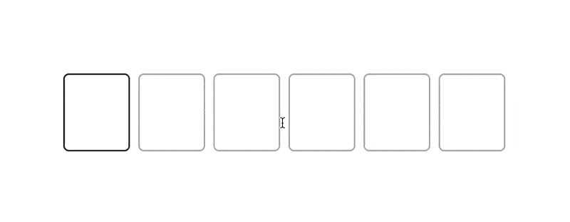
When we try this, we get the following result:
However, you might have noticed that we're duplicating the filtering logic, so let's extract that to a method and then change the input and paste methods to use that instead:
// app/javascript/controllers/otp_controller.js
export default class extends Controller {
  // Rest of the code

  input() {
    const filtered = this.#filter(this.inputTarget.value)
    if (filtered !== this.inputTarget.value) this.inputTarget.value = filtered

    this.#updateBoxes()
  }

  async paste(evt) {
    evt.preventDefault()

    try {
      const filtered = this.#filter(await navigator.clipboard.readText())
      this.inputTarget.value = filtered
      this.#updateBoxes()
      this.inputTarget.focus()
    } catch (error) {
      console.error('Failed to read clipboard contents:', error)
    }
  }

  #filter(text) {
    return (text.match(this.regex) || [])
      .slice(0, this.boxTargets.length)
      .join("")
  }

  // Rest of the code
}
Which makes the code easier to understand while keeping the same behavior:
Multiple inputs
For our second approach, we will add the same code input, but it will be hidden, and we will add multiple inputs that will act as the slots of our OTP input.
Let's start by defining the view consisting of a container which defines the Stimulus controller, a hidden code field, an N number of inputs— we will use 6 for this example— and a submit button:
<%# app/views/otp/new.html.erb %>
<div class="mt-4" data-controller="otp" data-otp-pattern-value="[0-9]">
  <%= hidden_field_tag :code, params[:code], class: "w-full border border-gray-300 rounded-lg p-2", data: { otp_target: "hiddenField" } %>
  <div class="flex space-x-3 my-4">
    <% 6.times do |i| %>
      <input
        type="text"
        inputmode="numeric"
        data-otp-target="digit"
        data-action="input->otp#input"
        data-index="<%= i %>"
        autocomplete="one-time-code"
        class="w-12 h-12 text-2xl font-bold border-2 border-gray-300 focus:outline-none focus:border-slate-700 rounded-lg text-center">
    <% end %>
  </div>
  <%= submit_tag "Verify", class: "px-8 bg-slate-900 text-white rounded-full py-2 mt-2" %>
</div>
This produces the following result:
Now, let's work on the Stimulus controller, starting with the input action. What we want to happen is the following:
- Only allow input that matches the regex that we pass through the
patternvalue. - Only allow one character to be set as the value. In the next step, when we add navigation, we will be able to replace the current value of the slot because of this.
- If the input matches the regex, the
hiddenFieldshould be updated with every digit we've input at the moment. - After the value is updated, the focus should change to the next slot.
// app/javascript/controllers/otp_controller.js
import { Controller } from '@hotwired/stimulus'

export default class extends Controller {
  static targets = ["digit", "hiddenField"]
  static values = {
    pattern: String
  }

  connect() {
    this.digitTargets[0]?.focus()
  }

  input(evt) {
    const field = evt.target
    let value = field.value
    const index = this.digitTargets.indexOf(field)

    if (value.length > 1) {
      field.value = value.slice(-1)
    }

    if (!this.regex.test(value)) {
      field.value = ""
      return
    }

    if (field.value && index < this.digitTargets.length - 1) {
      this.digitTargets[index + 1].focus()
    }

    this.#updateHiddenField()
  }

  #updateHiddenField() {
    const code = this.digitTargets.map(digit => digit.value).join("")
    this.hiddenFieldTarget.value = code;
  }

  get regex() {
    return new RegExp(this.patternValue)
  }
}
This produces the following result:
However, we cannot navigate between the slots yet.
Here's how the feature should work:
- We should be able to navigate using the arrow keys to the right and to the left.
- If we are at the first slot or last slot, we shouldn't be able to navigate further left or right.
- We should be able to delete input by using the
Backspacekey, and the hidden field should be updated accordingly.
We can use Stimulus key mappings, but they don't include a mapping for the Backspace so let's add a custom key mapping:
// app/javascript/controllers/application.js
import { Application, defaultSchema } from "@hotwired/stimulus"

const customSchema = {
  ...defaultSchema,
  keyMappings: {
    ...defaultSchema.keyMappings,
    backspace: "Backspace"
  }
}
const application = Application.start(document.documentElement, customSchema)
Now, we can add the keyboard events to our data-action and match them to the navigate action of the controller:
<input
  type="text"
  inputmode="numeric"
  data-otp-target="digit"
  data-action="input->otp#input keydown.left->otp#navigate keydown.right->otp#navigate keydown.backspace->otp#navigate"
  data-index="<%= i %>"
  autocomplete="one-time-code"
  class="w-12 h-12 text-2xl font-bold border-2 border-gray-300 focus:outline-none focus:border-slate-700 rounded-lg text-center">
<% end %>
Let's define the action:
export default class extends Controller {
  // Rest of the code
  navigate(evt) {
    evt.preventDefault()

    const key = evt.key
    const currentField = evt.target
    const index = this.digitTargets.indexOf(currentField)

    if (key === "Backspace") {
      currentField.value = ""
      this.#updateHiddenField()
    }

    const direction = this.directions[key] || 0
    const nextIndex = index + direction

    if (nextIndex >= 0 && nextIndex < this.digitTargets.length) {
      this.digitTargets[nextIndex].focus()
    }
  }

  // Rest of the code

  get directions() {
    return {
      "ArrowLeft": -1,
      "ArrowRight": 1,
      "Backspace": -1
    }
  }
}
Here, we get the current index and set it to the index variable, we use the event's key to map it to a direction which is 1 when we navigate to the right and -1 when we navigate to the left.
Then, we define the nextIndex by adding the current index with the direction and finally set the focus to the appropriate slot.
We also add a special case for the Backspace value where we set the current slot value to an empty string and update the hidden field accordingly.
The result looks like this:
Handling paste
Now that the component is working like we want, let's add the ability for users to paste the code.
We start by adding paste->otp#paste to the input's data-action.
Then, we add the paste action to the controller:
export default class extends Controller {
  // Rest of the code

  async paste(evt) {
    evt.preventDefault()

    try {
      const text = (await navigator.clipboard.readText()).trim()
      const filteredText = this.#filterText(text)

      if (filteredText.length === 0) return

      this.digitTargets.forEach((digit, i) => {
        if (i < filteredText.length) {
          digit.value = filteredText[i]
        }
      })

      this.#updateHiddenField()

      // Focus the next empty slot or the last slot
      const nextEmptyIndex = Math.min(filteredText.length, this.digitTargets.length - 1)
      this.digitTargets[nextEmptyIndex].focus()
    } catch (error) {
      console.error('Failed to read clipboard contents:', error)
    }
  }

  #filterText(text) {
    return text.split('').filter(char => this.regex.test(char)).slice(0, this.digitTargets.length)
  }
}
Here, we're using the clipboard content from the readText function which returns a Promise, so we need to add the await to make sure that the text variable contains the clipboard's content. This also means that the paste function has to be async.
We've also added proper filtering of the pasted text and error handling for clipboard access issues.
The result looks like this:
Making it accessible
Now that we have everything working like we expect, let's analyze how we can make the component accessible.
The steps we will follow are:
- Add descriptive
idsto various elements in the HTML to aid users understand the context for each one of them. - Add content that's only visible for screen readers using the
sr-onlyCSS class. There, we can give detailed instructions on how to use the component. - Add a
fieldsetandlegendto the input group to group them semantically. - Use the
aria-describedbylabel to associate instructions with inputs. - Add
role="alert"andaria-live="polite"for error messages (not handled in this tutorial). - Add
aria-labelto every input to indicate the digit it's supposed to receive and anaria-describedbyfor further instructions if necessary. Then, addmaxlength="1"to the inputs andrequiredvalidation.
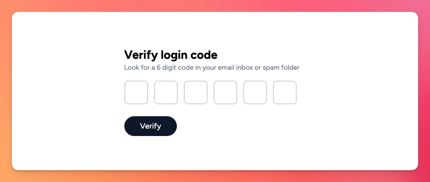
The result should look something like this:
<div class="max-w-screen-sm mx-auto py-24">
  <div class="bg-white rounded-lg p-8">
    <h1 class="text-2xl font-bold" id="otp-heading">Verify login code</h1>
    <p class="text-sm text-gray-500" id="otp-description">Look for a 6 digit code in your email inbox or spam folder</p>

    <div id="otp-error" class="text-red-600 text-sm mt-2 hidden" role="alert" aria-live="polite">
      <!-- Error messages -->
    </div>

    <div class="mt-4" data-controller="otp" data-otp-pattern-value="[0-9]">
      <%= hidden_field_tag :code, params[:code], class: "w-full border border-gray-300 rounded-lg p-2", data: { otp_target: "hiddenField" } %>
      <div class="sr-only" id="otp-instructions">
        Enter your 6-digit verification code. Use arrow keys to navigate between digits. You can also paste the entire code at once.
      </div>

      <fieldset class="flex space-x-3 my-4"
                role="group"
                aria-labelledby="otp-heading"
                aria-describedby="otp-description otp-instructions">
        <legend class="sr-only">6-digit verification code</legend>
        <% 6.times do |i| %>
          <input
            type="text"
            inputmode="numeric"
            data-otp-target="digit"
            data-action="input->otp#input keydown.left->otp#navigate keydown.right->otp#navigate keydown.backspace->otp#navigate paste->otp#paste"
            data-index="<%= i %>"
            autocomplete="one-time-code"
            aria-label="Digit <%= i + 1 %> of 6"
            aria-describedby="otp-instructions"
            maxlength="1"
            pattern="[0-9]"
            required
            class="w-12 h-12 text-2xl font-bold border-2 border-gray-300 focus:outline-none focus:border-slate-700 focus:ring-2 focus:ring-slate-700 focus:ring-opacity-50 rounded-lg text-center">
        <% end %>
      </fieldset>

      <%= submit_tag "Verify",
          class: "px-8 bg-slate-900 hover:bg-slate-800 focus:bg-slate-800 focus:outline-none focus:ring-2 focus:ring-slate-700 focus:ring-opacity-50 disabled:opacity-50 disabled:cursor-not-allowed text-white rounded-full py-2 mt-2 transition-colors",
          "aria-describedby": "otp-error" %>
    </div>
  </div>
</div>
If you can think of any other accessibility feature I missed here, please let us know and I will try my best to improve it.
Summary
In this article we learned how to build an OTP Input, also known as a verification input, using StimulusJS.
We worked on two separate ways to approach the issue, one that's accessible by default and another that needs some work to be accessible:
With a single visible input
This approach is accessible by default. The visible input acts as a container for the CSS representation of the slots.
Users can input the code as desired, and then we use some JS from a Stimulus controller to highlight the appropriate slots, filter the input against a pattern and focus the input when it corresponds.
With multiple inputs
This approach, which is not accessible by default, is used by many sites and component libraries, which makes it familiar to users.
To achieve the feature, we take the user input one character at a time, validate against a RegEx and then we focus the next slot if everything was successful.
We also added the ability to navigate between the inputs by using arrow keys and the Backspace key to give users the ability to edit the code if something is wrong.
All in all, both of these approaches have their pros and cons, but they can achieve the same level of accessibility if we put some work into it.
I hope this article can help you whenever you need to add an OTP Input field to your Rails or Stimulus only applications.
Have a good one and happy coding!
