Audio isn't the king of multimedia formats, video is. That's why finding a nice audio player isn't always an easy task.
In this article, we will build a custom audio player with Stimulus with customizable controls, responsive waveform visualization, and more.
We will be using Stimulus to give the desired functionality to our audio player and ViewComponent to help us with modularity and reusability:
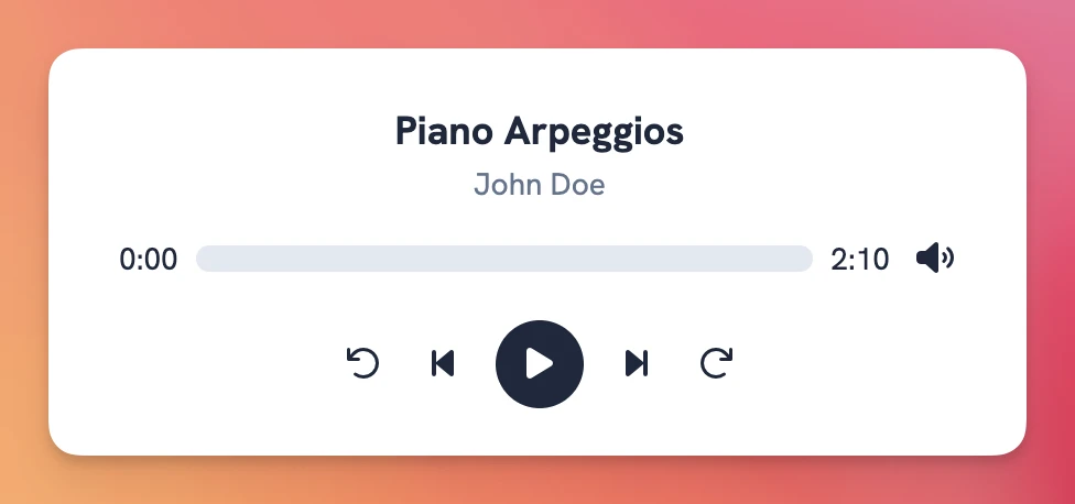
Let's start by seeing what we will build:
What we will build
By the end of this article, we will have a functioning audio player with some typical features an audio player should have plus some extra goodies:
- Keyboard commands.
- Waveform visualization.
- Responsiveness using the Resize Observer API in Stimulus.
- Ability to customize the appearance using ViewComponent variants.
The final result looks like this:
Application setup
Even though an actual audio player is by no means Rails specific, I will be using Rails because of its integration with Stimulus and ViewComponent.
You can accomplish the same we will in the tutorial using Stimulus by itself or even replacing it with vanilla JS, feel free to experiment and let us know how it goes!
Let's start by creating the app:
$ rails new podcast --css=tailwind --javascript=esbuild
Next, we add and install ViewComponent:
$ bundle add view_component && bundle install
Finally, we will also add the class variants gem to handle different styles for our audio player:
$ bundle add class_variants && bundle install
Besides these dependencies, I also included the Font Awesome icon kit for the sake of building the interface a bit faster, but you can use SVGs or any other icon library of your choosing.
Now that we have everything set up, let's start by building the interface.
Building the interface
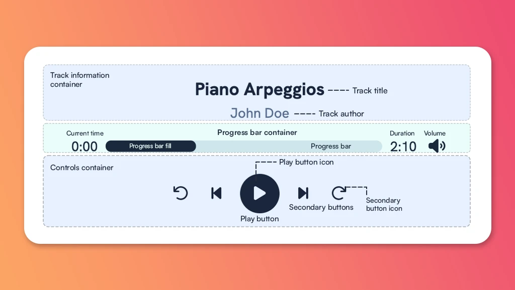
To make the process didactic, we will build the player interface, starting out with a basic progress bar.
Our final result for this section will look like this:
Viewing it from a component perspective, we can dissect three major sections: the track information, the progress bar and the controls section:
The first step is to create an AudioPlayerComponent:
$ bin/rails generate component AudioPlayer url title author
This will generate a component class and a corresponding empty view. The component should receive three parameters: the URL which is required, the title and author, which will have default values in case they're not present:
class AudioPlayerComponent < ViewComponent::Base
  def initialize(url:, title: "Untitled audio", author: "Unknown author")
    @url = url
    @title = title
    @author = author
  end
end
Now, let's define the basic HTML structure with the container and track info classes to get things started:
<%# app/views/components/audio_player_component.html.erb %>
<div class="<%= css_classes.render(:container) %>">
  <div class="<%= css_classes.render(:track_info) %>">
    <h5 class="<%= css_classes.render(:track_title) %>"><%= @title %></h5>
    <p class="<%= css_classes.render(:track_author) %>"><%= @author %></p>
  </div>
</div>
Next, let's add the classes to the base variant using the class_variants gem:
class AudioPlayerComponent < ViewComponent::Base
  def initialize(url:, title: "Untitled audio", author: "Unknown author")
    @url = url
    @title = title
    @author = author
  end

  def css_classes
    ClassVariants.build do
      base do
        slot :container, class: "w-full gap-2 bg-white dark:bg-slate-800 border border-slate-300 dark:border-slate-700 rounded-lg py-6 px-6"
        slot :track_info, class: "flex flex-col items-center justify-center gap-x-2 mb-3"
        slot :track_title, class: "text-lg font-bold text-slate-800 dark:text-slate-200"
        slot :track_author, class: "text-sm text-slate-500 dark:text-slate-200"
      end
    end
  end
end
Now, after rendering the component using <%= render AudioPlayerComponent.new(url: audio_url) %> in any view, we should get the following:
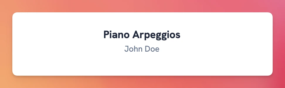
Of course, nothing too exciting for now. Let's add the progress bar with the current_time and duration.
We will use a container to group them, and we will use the --:-- placeholder for the time related attributes:
<div class="<%= css_classes.render(:container) %>">
  <div class="<%= css_classes.render(:track_info) %>">
    <h5 class="<%= css_classes.render(:track_title) %>"><%= @title %></h5>
    <p class="<%= css_classes.render(:track_author) %>"><%= @author %></p>
  </div>
  <div class="<%= css_classes.render(:progress_bar_container) %>">
    <div data-audio-player-target="currentTime" class="<%= css_classes.render(:time) %>">--:--</div>
    <div
      class="<%= css_classes.render(:progress_bar) %>">
      <div class="<%= css_classes.render(:progress_bar_fill) %>" style="width: 24%"></div>
    </div>
    <div class="<%= css_classes.render(:time) %>">--:--</div>
  </div>
</div>
We also add the classes to the component:
def css_classes
  ClassVariants.build do
    base do
      # Rest of the classes
      slot :time, class: "flex min-w-10 items-center justify-center text-sm text-slate-800 dark:text-slate-200"
      slot :progress_bar_container, class: "flex w-full items-center justify-between gap-x-2"
      slot :progress_bar, class: "flex w-full h-3 bg-slate-200 dark:bg-slate-700 rounded-md overflow-hidden"
      slot :progress_bar_fill, class: "h-full bg-slate-800 dark:bg-slate-200 animate-progress"
    end
  end
end
This should produce the following:
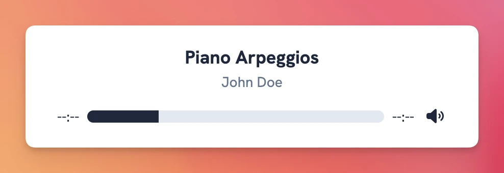
Notice that the progress fill width is hardcoded at this time.
Now, let's finish the interface by adding the icons with their corresponding container. For the icons, I'm using Lucide in case you want to follow along:
<div class="<%= css_classes.render(:container) %>">
  <div class="<%= css_classes.render(:track_info) %>">
    <h5 class="<%= css_classes.render(:track_title) %>"><%= @title %></h5>
    <p class="<%= css_classes.render(:track_author) %>"><%= @author %></p>
  </div>
  <div class="<%= css_classes.render(:progress_bar_container) %>">
    <div class="<%= css_classes.render(:time) %>">--:--</div>
    <div
      class="<%= css_classes.render(:progress_bar) %>">
      <div class="<%= css_classes.render(:progress_bar_fill) %>" style="width: 24%"></div>
    </div>
    <div class="<%= css_classes.render(:time) %>">--:--</div>
    <button class="<%= css_classes.render(:secondary_button) %>">
      <i data-lucide="volume" class="<%= css_classes.render(:secondary_button_icon) %>"></i>
    </button>
  </div>
  <div class="<%= css_classes.render(:controls) %>">
    <button class="<%= css_classes.render(:secondary_button) %>">
      <i data-lucide="rotate-ccw" class="<%= css_classes.render(:secondary_button_icon) %>"></i>
    </button>
    <button class="<%= css_classes.render(:secondary_button) %>">
      <i data-lucide="step-back" class="<%= css_classes.render(:secondary_button_icon) %>"></i>
    </button>
    <button class="<%= css_classes.render(:play_button) %>">
      <i data-lucide="play" class="<%= css_classes.render(:play_button_icon) %>"></i>
    </button>
    <button class="<%= css_classes.render(:secondary_button) %>">
      <i data-lucide="step-forward" class="<%= css_classes.render(:secondary_button_icon) %>"></i>
    </button>
    <button class="<%= css_classes.render(:secondary_button) %>">
      <i data-lucide="rotate-cw" class="<%= css_classes.render(:secondary_button_icon) %>"></i>
    </button>
  </div>
</div>
We also add the classes to the component:
def css_classes
  ClassVariants.build do
    base do
      # Rest of the classes
      slot :controls, class: "flex items-center gap-x-3 justify-center mt-4"
      slot :play_button, class: "w-10 h-10 rounded-full bg-slate-800 dark:bg-slate-400 flex items-center justify-center"
      slot :play_button_icon, class: "text-white dark:text-slate-200"
      slot :secondary_button, class: "w-6 h-6 rounded-full"
      slot :secondary_button_icon, class: "text-slate-800 dark:text-slate-200"
    end
  end
end
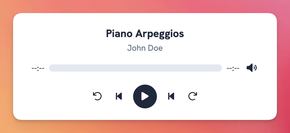
This produces the same player we saw at the beginning without any functionality:
Now it's time to hook everything up using Stimulus to make the audio player actually work.
But first, let's dive a bit into using web audio and how it works:
Understanding Web Audio
As of today, there are mainly two ways to work with audio in the browser: the Web Audio API and HTML 5 Audio with the <audio> tag or the Audio class.
The former is more powerful, includes many more features, and lets us manipulate the audio more granularly.
Some notable features of the Web Audio API are:
- Audio graph: it uses a modular, node-based approach to handling audio, where audio flows through a network of connected nodes that have separate functions. The combination of these nodes allows us to manipulate audio in a more granular way.
- Advanced processing: it supports filters and equalization, reverb, delay, analyzers, oscillators, compression, 3D spatial audio and more.
- Precise timing: it offers synchronization that's sample-accurate.
-
Access to raw audio data: this means we can manipulate the audio directly by accessing raw audio using the
AudioBufferand theFloat32Arrayfeatures.
However, its power doesn't come without a cost: it's more complex, and can be resource intensive, which might be undesirable in some cases.
HTML 5 Audio
The HTML 5 Audio, represented with the <audio> element, is used to embed sound in documents.
By using the tag with a valid source and passing the controls attribute:
<audio src="https://filesamples.com/samples/audio/mp3/sample3.mp3" controls />
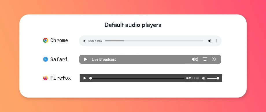
We can produce a default player, whose appearance varies depending on the browser used:
Besides defining an explicit <audio> tag, we can also use the JavaScript Audio class to programmatically play audio in the browser:
const url = "https://filesamples.com/samples/audio/mp3/sample3.mp3"
const audio = new Audio(url)
audio.addEventListener("canplaythrough", () => audio.play())
We will learn more about using the Audio class later. For now, let's learn about the attributes we can pass to the <audio> tag:
Attributes
Some important attributes for the <audio> tag are:
-
src: indicates the URL of the audio to embed. It's optional because we can also use the
<source>tag inside the audio block to pass the audio file or files we want to use for playback. - controls: if present, the player shows controls that allow users to perform actions with the audio, like play, pause, seek, adjust the volume or playback speed.
-
crossorigin: it indicates whether to use CORS to fetch the audio file or not. When present, it accepts two values:
anonymousto send the cross-origin request without credentials anduse-credentialsto send it using credentials. - autoplay: audio playback starts as soon as possible when this attribute is specified. Be wary about using it, autoplaying audio can be very annoying, and modern browsers have strict policies that prevent it from working without user interaction.
-
preload: it defines whether the audio or its metadata will be preloaded or not. It accepts three values:
nonewhich indicates that the audio should not be preloaded,metadatawhich indicates that only the metadata should be preloaded; andautowhich indicates that the whole audio file should be downloaded. Note that it provides a hint to the browser, the behavior is not assured.
Other attributes like muted to determine if the player is initially muted or loop to define whether the audio is reset to the starting point after finishing can also be passed to the <audio> tag.
Events
There are many events that we can attach to the audio element or an Audio instance.
Many of them, like complete which indicates that the element has finished loading all of its content, are useful for tracking the audio's loading and playback state:
- canplay: the browser can play the audio, but it hasn't been fully loaded yet.
- canplaythrough: the browser estimates that it can play the audio up to the end without stopping for buffering.
- ended: fires when the audio has finished playing because the end was reached.
-
timeupdate: fires when the
currentTimeattribute has been updated. - play: fires every time the audio starts playing.
-
pause: fires every time the audio stops playing. It also fires when the audio finishes playing along with the
endedevent. -
loadedmetadata: fires when the audio metadata is loaded. This metadata includes things like
duration,seekable,networkState,playbackRateand other attributes that can be accessed through the audio instance. -
seeked: fires when the user performs a seek operation, which means that the playback position changes. It's also accompanied by the
seekingevent, which returns a boolean: when seeked is fired,seekingis changed tofalse.
For our intents and purposes, knowing about these events is more than enough to build our audio player.
If you're interested in learning more about audio on the web, check the MDN Web Docs on Audio to explore everything there is to know about it.
Now that we know about the events, let's start by making the audio player functional with Stimulus:
Player functionality with Stimulus
We will start by creating an empty Stimulus controller:
// app/javascript/controllers/audio_player_controller.js
import { Controller } from "@hotwired/stimulus"

export default class extends Controller {
  connect() {
    console.log("Hello from the audio player")
  }
}
Now, based on the component dissection we previously did, we can consider the following targets for our controller:
-
The play icon: we will use the
clickaction on the play icon to toggle the play status and change the icon depending on that status. We could also use theplayandpauseevents, but we will stick with the action for simplicity's sake. -
The current playback time: showing '--:--' by default, we will use the
timeupdateevent to keep it in sync with the audio playback time. -
The audio duration: we will fill this when the
loadedmetadataevent fires. -
The progress bar container: we will use it to calculate the new
currentTimewhen a user clicks to seek within the progress bar. -
The progress bar fill: having an absolute value regarding the container, we will change its width dynamically by calculating it comparing the container's width with the relation between the
currentTimeand thedurationto obtain a percentage value.
As for the values, we will just use a url value to instantiate an Audio instance with it.
Considering this, the structure for our component should be the following:
<div data-controller="audio-player"
    data-audio-player-url-value="<%= @url %>"
    class="<%= css_classes.render(:container) %>">
  <div class="<%= css_classes.render(:track_info) %>">
    <h5 class="<%= css_classes.render(:track_title) %>"><%= @title %></h5>
    <p class="<%= css_classes.render(:track_author) %>"><%= @author %></p>
  </div>
  <div class="flex items-center justify-between gap-x-2">
    <div data-audio-player-target="currentTime" class="<%= css_classes.render(:time) %>">--:--</div>
    <div
      data-audio-player-target="progressBar"
      data-action="click->audio-player#seek"
      class="<%= css_classes.render(:progress_bar) %>">
      <div data-audio-player-target="progressBarFill" style="width: 0" class="<%= css_classes.render(:progress_bar_fill) %>"></div>
    </div>
    <div data-audio-player-target="duration" class="<%= css_classes.render(:time) %>">--:--</div>
    <button
      class="<%= css_classes.render(:secondary_button) %>">
      <i data-lucide="volume" class="<%= css_classes.render(:secondary_button_icon) %>" data-audio-player-target="volumeIcon"></i>
      <i data-lucide="volume-x" class="hidden <%= css_classes.render(:secondary_button_icon) %>" data-audio-player-target="mutedVolumeIcon"></i>
    </button>
  </div>
  <div class="<%= css_classes.render(:controls) %>">
    <button class="<%= css_classes.render(:secondary_button) %>">
      <i data-lucide="rotate-ccw" class="<%= css_classes.render(:secondary_button_icon) %>"></i>
    </button>
    <button class="<%= css_classes.render(:secondary_button) %>">
      <i data-lucide="step-back" class="<%= css_classes.render(:secondary_button_icon) %>"></i>
    </button>
    <button class="<%= css_classes.render(:play_button) %>" data-action="audio-player#togglePlay">
      <i data-lucide="play" data-audio-player-target="playIcon" class="<%= css_classes.render(:play_button_icon) %>"></i>
    </button>
    <button class="<%= css_classes.render(:secondary_button) %>">
      <i data-lucide="step-forward" class="<%= css_classes.render(:secondary_button) %>"></i>
    </button>
    <button class="<%= css_classes.render(:secondary_button) %>">
      <i data-lucide="rotate-cw" class="<%= css_classes.render(:secondary_button_icon) %>"></i>
    </button>
  </div>
</div>
Now, let's define the targets, the value and the connect method where we will add the event listeners:
import { Controller } from "@hotwired/stimulus"
import { formatTime } from "../lib/time"

export default class extends Controller {
  static targets = ["playIcon", "currentTime", "duration", "progressBar", "progressBarFill"]
  static values = { url: String }

  connect() {
    this.audio = new Audio(this.urlValue)

    this.boundSetInitialTime = this._setInitialTime.bind(this)
    this.boundHandleTimeUpdate = this._handleTimeUpdate.bind(this)

    this.audio.addEventListener("loadedmetadata", this.boundSetInitialTime)
    this.audio.addEventListener("timeupdate", this.boundHandleTimeUpdate)
  }

  disconnect() {
    this.audio.removeEventListener("loadedmetadata", this.boundSetInitialTime)
    this.audio.removeEventListener("timeupdate", this.boundHandleTimeUpdate)
  }

  togglePlay() {
    if (this.audio.paused) {
      this.audio.play()
    } else {
      this.audio.pause()
    }

    this._togglePlayIcon()
  }

  _togglePlayIcon() {
    const isPlaying = !this.audio.paused
    const iconName = isPlaying ? 'pause' : 'play'
    this.playIconTarget.setAttribute('data-lucide', iconName)

    if (typeof lucide !== 'undefined') {
      lucide.createIcons()
    }
  }

  _setInitialTime() {
    this.durationTarget.textContent = formatTime(this.audio.duration)
    this.currentTimeTarget.textContent = formatTime(this.audio.currentTime)
  }

  _handleTimeUpdate() {
    this.currentTimeTarget.textContent = formatTime(this.audio.currentTime)

    const fillPercentage = (this.audio.currentTime / this.audio.duration) * 100
    this.progressBarFillTarget.style.width = `${fillPercentage}%`
  }
}
In the connect method, we added two functions to be executed when the track is loaded and every time the playback time is updated: one sets the duration of the track and the other to set the currentTime value and update the progress bar.
Then, we set the togglePlay method, which is executed every time the user clicks on the play button. There we play or pause the audio depending on its current state and toggle the play icon to show a pause icon if the audio is playing.
We're using a formatTime helper which does the following:
export const formatTime = (time) => {
  const minutes = Math.floor(time / 60)
  const seconds = Math.floor(time % 60)
  return `${minutes}:${seconds.toString().padStart(2, '0')}`
}
This helper, using the padStart String method, makes sure that we produce a number like 1:05 to indicate time instead of something like 1:5 which is not readable as time.
After this, we have a functional player that can play and pause the track we pass to it:
Seek functionality
You might have noticed that we defined a seek action in the HTML which gets triggered when a user clicks somewhere in the progress bar container.
Let's add the code for this behavior in our controller:
export default class extends Controller {
  // Rest of the code
  seek(evt) {
    this.audio.pause()

    const { left, width } = this.progressBarTarget.getBoundingClientRect()
    const clickPosition = evt.clientX - left
    const percentage = Math.max(0, Math.min(1, clickPosition / width))

    this.audio.currentTime = percentage * this.audio.duration
    this.progressBarFillTarget.style.width = `${percentage * 100}%`
    this.audio.play()
  }
}
We're calculating the position of the click regarding the progress bar and calculating the percentage of the progress bar width where we made the click by clamping the number so we are sure to obtain a value between 0 and 1.
Additionally, we're pausing the audio at the beginning of the method and playing it again at the end, in case our users have a slow connection, to avoid the weird state where the seek would complete before the loading could catch up.
Currently, the player behaves like this:
Now, we will add the ability to skip to the beginning or the end of the track. Let's start by adding the connection to the HTML:
<button class="<%= css_classes.render(:secondary_button) %>" data-action="audio-player#goToStart">
  <i data-lucide="step-back" class="<%= css_classes.render(:secondary_button_icon) %>"></i>
</button>
<%# Play button goes here %>
<button class="<%= css_classes.render(:secondary_button) %>" data-action="audio-player#goToEnd">
  <i data-lucide="step-forward" class="<%= css_classes.render(:secondary_button) %>"></i>
</button>
Then, we add the functionality to our Stimulus controller:
export default class extends Controller {
  // Rest of the code

  goToStart() {
    this._goToTime(0)
  }

  goToEnd() {
    this._goToTime(this.audio.duration)
  }

  _goToTime(time) {
    this.audio.currentTime = time
    if (this.audio.paused) this.togglePlay();
  }
}
We added a _goToTime private method to avoid duplication.
Admittedly, the button to go to the end of the track isn't really useful, but we can use it to add a playlist functionality if we need to.
Keyboard events
The next thing we will add is the ability to seek using the left and right arrow keys. To achieve this, we will define two methods: seekFoward and seekBackward in charge of changing the audio's currentTime by an amount of time that we will define using the seekTime value, which defaults to 10 seconds.
Let's start by defining them in our components HTML:
<div data-controller="audio-player"
  data-audio-player-url-value="<%= @url %>"
  data-action="keydown.right@window->audio-player#seekForward keydown.left@window->audio-player#seekBackward"
  class="<%= css_classes.render(:container) %>">
</div
Next, let's define the methods in our Stimulus controller:
export default class extends Controller {
  // Rest of the code
  static values = {url: String, seekTime: Number }
  static DEFAULT_SEEK_TIME = 10

  seekForward() {
    this.audio.currentTime += this.seekTimeValue || this.constructor.DEFAULT_SEEK_TIME
    if (this.audio.paused) this.togglePlay()
  }

  seekBackward() {
    this.audio.currentTime -= this.seekTimeValue || this.constructor.DEFAULT_SEEK_TIME
    if (this.audio.paused) this.audio.togglePlay()
  }
}
Now, we will add the ability to pause using the space bar, for this we just need to hook up our public togglePlay method with the keyboard event by modifying the play button:
<button class="<%= css_classes.render(:play_button) %>" data-action="audio-player#togglePlay">
  <i data-lucide="play" data-audio-player-target="playIcon" class="<%= css_classes.render(:play_button_icon) %>"></i>
</button>
However, if we do this and press the space bar while the mouse pointer is over the play button, we will get the playback quickly toggled back to its starting state.
To prevent this, we need to prevent the event's default behavior:
export default class extends Controller {
  // Rest of the code
  togglePlay(evt) {
    evt.preventDefault()

    if (this.audio.paused) {
      this.audio.play()
    } else {
      this.audio.pause()
    }

    this._togglePlayIcon()
  }
  // Rest of the code
}
However, there's a little catch with the way we hooked the events: you might have noticed that they are attached to the window
But there's an issue with this approach: what happens if we have something like an input field in the window where we also have the player.
Well, if a user is within the field, the events will fire whenever the keys are pressed, which is not desirable.
To avoid this, we will add a private method called isFormFieldFocused and early return from the methods that are hooked with keyboard events:
export default class extends Controller {
  // Rest of the code
  seekForward() {
    if (this._isFormFieldFocused()) return
    const seekValue = this.seekTimeValue || this.constructor.DEFAULT_SEEK_TIME

    this._goToTime(this.audio.currentTime + seekValue)
  }

  _isFormFieldFocused() {
    const activeElement = document.activeElement;
    const formFields = ['INPUT', 'TEXTAREA', 'SELECT', '[contenteditable]'];

    return formFields.includes(activeElement.tagName) ||
           activeElement.hasAttribute('contenteditable') ||
           activeElement.closest('[contenteditable]') !== null
  }
}
Volume control
The next thing we will add to our audio player is the ability to control the playback volume.
The first step is to add the required HTML to our component. For this, we will need to wrap the volume button with a container and also add another <div> for the actual volume bar:
<%# app/components/audio_player_component.html.erb %>
<div class="flex items-center gap-x-1">
  <div class="<%= css_classes.render(:volume_container) %>" data-audio-player-target="volumeContainer">
    <div
      class="<%= css_classes.render(:volume_bar) %>"
      data-action="click->audio-player#setVolume"
      data-audio-player-target="volumeBar">
      <div class="<%= css_classes.render(:volume_bar_fill) %>" data-audio-player-target="volumeBarFill"></div>
    </div>
  </div>
  <button
    class="<%= css_classes.render(:secondary_button) %>"
    data-action="click->audio-player#toggleVolumeBar">
    <i data-lucide="volume" data-audio-player-target="volumeIcon" class="<%= css_classes.render(:secondary_button_icon) %>"></i>
    <i data-lucide="volume-x" data-audio-player-target="mutedVolumeIcon" class="hidden <%= css_classes.render(:secondary_button_icon) %>"></i>
  </button>
</div>
Notice that we've assigned targets for the volumeContainer which holds everything, the volumeBar which is the container where users will actually click and the volumeBarFill which is the div whose width we'll adjust when setting the volume, just like we did with the playback progress bar before.
We also added click events for the volume icon, which will trigger the toggleVolumeBar method to display the volume bar and setVolume to actually set the volume using the user's input.
Next, we add the classes to the AudioPlayerComponent:
# app/components/audio_player_component.rb
class AudioPlayerComponent < ViewComponent::Base
  def css_classes
    ClassVariants.build do
      base do
        # Rest of the classes
        slot :volume_container, class: "w-0 overflow-hidden transition-all duration-300"
        slot :volume_bar, class: "w-24 h-2 bg-slate-200 rounded-md overflow-hidden relative"
        slot :volume_bar_fill, class: "absolute bg-slate-900 h-full rounded-md"
      end
    end
  end
end
Finally, we add the functions to the controller:
export default class extends Controller {
  static targets = ["currentTime",
    "duration",
    "progressBar",
    "progressBarFill",
    "volumeContainer",
    "volumeBar",
    "volumeBarFill",
    "volumeIcon",
    "mutedVolumeIcon",
    "playIcon"
  ]
  // Rest of the code

  connect() {
    this.audio = new Audio(this.urlValue)
    this._setInitialVolume()

    // Rest of the initialization code
  }

  _setInitialVolume() {
    // We set the volume bar width to match the audio volume which is usually set to 1.
    this.volumeBarFillTarget.style.width = `${this.audio.volume * 100}%`
  }

  toggleVolumeBar() {
    this.volumeContainerTarget.classList.toggle("w-0")
    this.volumeContainerTarget.classList.toggle("w-24")
  }

  setVolume(evt) {
    const { left, width } = this.volumeBarTarget.getBoundingClientRect()
    const clientX = evt.clientX;
    const clickPosition = clientX - left
    const percentage = Math.max(0, Math.min(1, clickPosition / width))

    this.volumeBarFillTarget.style.width = `${percentage * 100}%`
    this.audio.volume = percentage
  }
}
Which results in the following:
Keyboard muting
Finally, we will also add a nice-to-have feature: muting the player using the “M” key.
Just like we did before, to achieve this we need to add the event to the browsers window in our HTML:
<div data-controller="audio-player"
    data-audio-player-url-value="<%= @url %>"
    data-action="keydown.right@window->audio-player#seekForward
      keydown.left@window->audio-player#seekBackward
      keydown.m@window->audio-player#toggleMute"
    class="<%= container_classes %>">
<%# Rest of the component %>
</div>
We also have to assign targets to the volume icon and add another icon for the muted state so it loads before we have to show it:
<button
  class="<%= css_classes.render(:secondary_button) %>"
  data-action="click->audio-player#toggleVolumeBar">
  <i data-lucide="volume" data-audio-player-target="volumeIcon" class="<%= css_classes.render(:secondary_button_icon) %>"></i>
  <i data-lucide="volume-x" data-audio-player-target="mutedVolumeIcon" class="hidden <%= css_classes.render(:secondary_button_icon) %>"></i>
</button>
Then, we add the toggleMute method to our controller:
export default class extends Controller {
  static targets = ["currentTime", "duration", "progressBar", "progressBarFill", "volumeIcon", "playIcon", "mutedVolumeIcon"] // Added targets for the volume and mutedVolume icons
  // Rest of the code

  toggleMute() {
    if (this._isFormFieldFocused()) return

    this.audio.muted = !this.audio.muted
    this.volumeIconTarget.classList.toggle('!hidden')
    this.mutedVolumeIconTarget.classList.toggle('!hidden')
  }
}
After doing this, we should have the following behavior in our player:
Waveform visualization
Adding a waveform visualization is usually a good complement for an audio player.
To implement it in our player, we can replace the progress bar starting with a placeholder which produces random peaks that look like a waveform but aren't actually generated from the waveform itself.
Because of the length of the task, we published the waveform related code in a new article: waveform visualization with Ruby and Stimulus.
In there, we make a WaveformVisualizer class that is responsible for generating the waveform using the Canvas API.
When initializing the controller we also initialize the waveform by instantiating the class and passing the waveform target, and we also call it in the _handleTimeUpdate function and also remove the references to the progressBarFill target because we aren't using it anymore.
This results in the following experience:
Further work
There are many things that you can add to the audio player to make it more versatile or to better fit your needs.
Some that come to mind are:
-
Variants: we introduced the base variant to get things started . You can easily add more variants using the
class_variantsgem by declaring them as arguments of thebuildmethod. Y -
Playlist feature: you can achieve this by separating the tracks of your playlist into another Stimulus controller like
track_controllerand using the Outlet API or you can just add the tracks as target and hold the current track using a value likecurrentTrackwhich holds a reference to the track that's currently playing. -
Advanced visualizations: this would require the use of the
Web Audio APIbut you can create visualizations using theAnalyserNodeto produce visualizations based on the waveform, bar graph, among others. - Volume normalization: if you're working with multiple tracks which you cannot control, you can use the audio context to normalize the audio by manipulating the actual samples from the buffer. This results in tracks that are similar in terms of volume, which produces a better experience for users.
- Audio manipulation: if you want to let users have some control over their listening experience, you can add features like equalization, filtering or get more creative with things like distortion, compression, or reverberation. Of course, most players won't need these features, and they might even be excessive for regular users, but some power users might enjoy the ability to customize their experience.
- Alternative sources: you could have a source for different audio qualities and use them depending on the user's connection, so the loading experience is as fast as possible. This might be unnecessary if you're working mainly with voices because the quality difference is harder to tell, but your users with slow connections will appreciate you going the extra mile. ## Summary In this article, we built an audio player using Stimulus and ViewComponent.
We did it by using the HTML 5 Audio element programmatically with the Audio class, which is more than enough to build a player.
We added basic features like seek functionality, keyboard commands, the ability to mute and volume control which are common to most audio players.
Finally, we added a basic waveform visualization by using the code from another article to make this one more digestible.
In case you need more advanced features for the player or to work more granularly with audio, you can always use the Web Audio API which is more powerful but a bit more complex as well.
I hope you enjoyed the making of the audio player and that it can help you build your next project that requires an audio player.
Have a good one and happy coding!